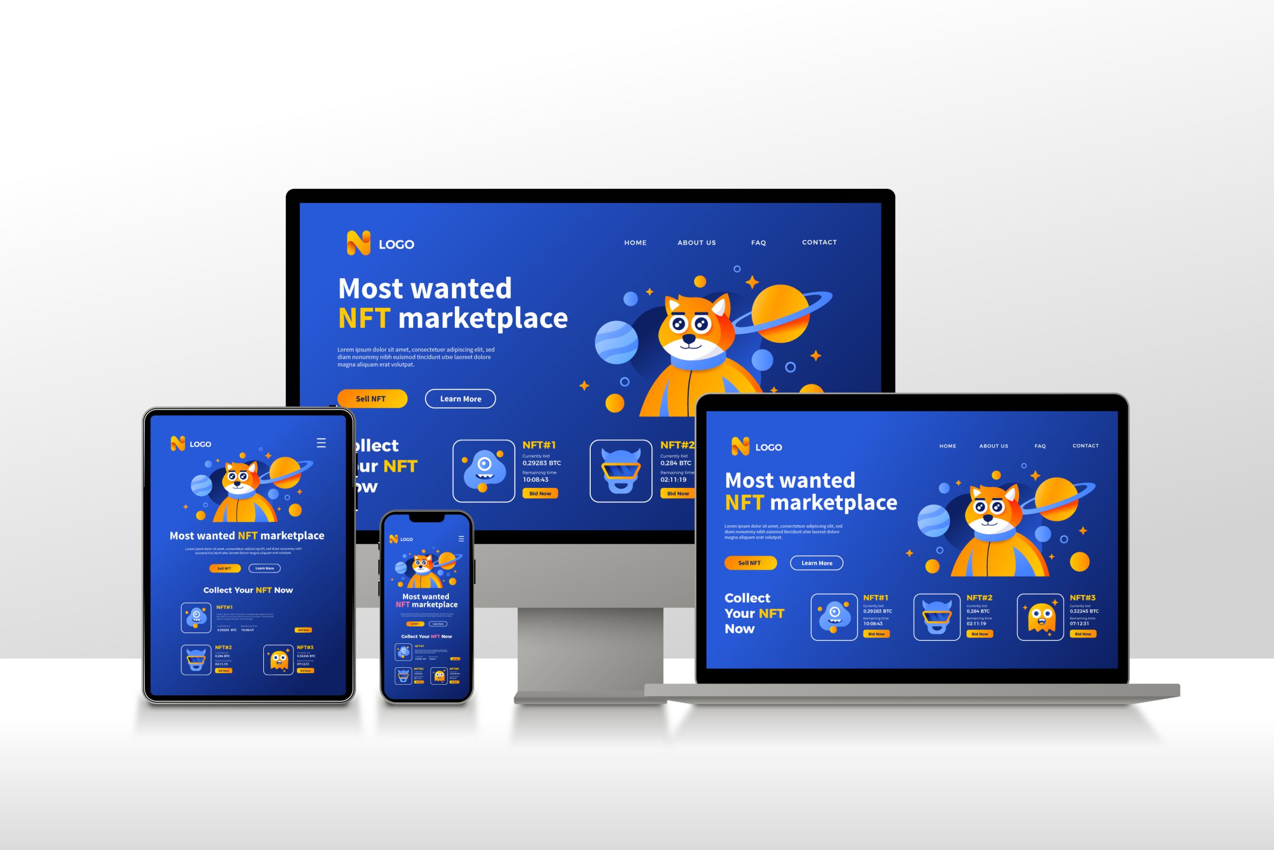
Responsive web design has become a critical aspect of creating successful online experiences, especially now that users access websites on a multitude of devices. In this blog, we will explore what responsive web design is and how it helps businesses deliver a seamless user experience across various devices and screen sizes.
What is Responsive Web Design?
Responsive web design is an approach to designing and developing websites that ensures optimal viewing and interaction experiences across a range of devices, including desktop computers, laptops, tablets, and smartphones. Rather than creating separate websites or versions for each device, responsive design enables a single website to adapt and respond to the specific characteristics of each user’s device, providing an optimal user experience.
Key Principles of Responsive Web Design
1. Fluid Grids: Responsive websites utilize fluid grids that enable content and page elements to dynamically adjust their size relative to the screen dimensions. This ensures that the website layout remains proportionate and visually appealing across different devices.
2. Flexible Images: Images are a vital part of web design, and in responsive design, they need to be flexible as well. By using CSS techniques, images can be resized and scaled based on the screen size, preventing them from being too large or too small on different devices.
3. Media Queries: Media queries are CSS instructions that allow websites to apply different styles based on specific device characteristics, such as screen size, resolution, and orientation. By using media queries, responsive websites can adapt their layout, font sizes, and other design elements to provide an optimal user experience on each device.
4. Mobile-first Approach: With the increasing dominance of mobile devices, many web designers now adopt a mobile-first approach. This means designing and optimizing the website primarily for mobile devices, and then progressively enhancing the design for larger screens. This approach ensures that the website is fully functional and visually appealing on mobile devices, which are often more constrained in terms of screen size and performance.
Benefits of Responsive Web Design
1. Improved User Experience: Responsive design ensures that users can easily navigate and interact with a website on any device. Content, images, and navigation elements are resized and arranged for optimal usability, providing a seamless and intuitive experience.
2. Increased Mobile Traffic: Mobile devices generate a significant portion of web traffic. By having a responsive website, businesses can capture this mobile audience effectively, leading to increased engagement, conversions, and customer satisfaction.
3. Time and Cost Efficiency: Managing separate websites for different devices can be time-consuming and costly. Responsive design streamlines the development, maintenance, and content management process, as changes are reflected automatically across all devices.
4. Enhanced SEO: Search engines prefer responsive websites because they provide a consistent user experience across devices. Responsive design helps improve search engine visibility, rankings, and organic traffic, leading to increased online visibility and potential customer reach.
Conclusion
At Branbloc, we are kin to adopting a responsive approach to web design that allows businesses to deliver an exceptional user experience across devices, ensuring that their website adapts seamlessly to the diverse needs and preferences of users. By helping businesses we design for embrace responsive design principles, businesses our clients increase engagement, reach a broader audience, and ultimately drive conversions and business growth in our digitally connected world. Investing in responsive web design is essential to stay relevant, competitive, and provide a positive online experience for all users. And elevating your website to be responsive begins with here: leave us a message at +971507058207 or [email protected] to get started.

